Today graphics and advertising took part in a CV workshop with Jo Carter.
We got into groups and had to play along with a scenario Jo had provided. We had to shortlist 6 candidates out of 24 by looking at creative CVs through the eye of an employer. It was a great experience to switch roles and experience the process. I found it scary how quickly we perceived someone simply by looking at a piece of paper!
This workshop made it clear that employers are extremely busy people and will be put off by pages and pages of information as well as something that has a lot of design going on. Design is a matter of opinion so it's best to keep it stripped back and simple, lowering the chance of the employer not liking the aesthetics.
Absolutely no; comedy email addresses, information overload or over design.
Friday, 4 April 2014
Thursday, 3 April 2014
Keltie Cochrane - Final Design
As a work based learning module, I was required to develop my industry practice skills by participating in the live brief provided by Keltie Cochrane. Getting involved with this has improved my design techniques and I have gained a further understanding of how briefs are tackled in the 'real world'. Ideas need to have a strong concept and designers need to be quick thinkers.
For my final design I chose to go for the grunge graffiti look and developed this using Photoshop:

For my final design I chose to go for the grunge graffiti look and developed this using Photoshop:
Wednesday, 26 March 2014
Snug by Design Live Brief
I've tackled my first brief as part of my portfolio production module, which was to design a logo for Snug by Design; a local business that sells handcrafted home accessories. The spec for this logo was 'white text on a pastel background'.
I chose to create a design which would be on course with the 'vintage shabby chic' trend and reflected the products on sale; vintage handmade home accessories.
I'm so happy that Michelle has chosen my design to represent her business! This is a great opportunity for my work to get out there as she'll be attending various fairs across the country with her products.

Tuesday, 25 March 2014
Keltie Cochrane - Live Brief
We've been asked to expand on our experience of work week and develop our Keltie Cochrane STI awareness campaigns into a final outcome as part of our Work Based Learning Module.
I decided to go ahead with a hard hitting answer to the brief, showing the audience the a worst case scenario that shocks them into getting tested.
This was inspired by an HIV poster campaign which I felt was extremely powerful when it came to the audience feeling an emotion:


I really like the effect of the splats and decided to pursue a grunge effect
I decided to go ahead with a hard hitting answer to the brief, showing the audience the a worst case scenario that shocks them into getting tested.
This was inspired by an HIV poster campaign which I felt was extremely powerful when it came to the audience feeling an emotion:
Creating a seemingly normal scenario with an element that looks wrong and doesn't fit gives the audience something to think about which is something that I want to achieve.
I started my development by experimenting with different materials to see which would look most effective:
 |
| My original concept |
 |
| Using paint in a soft colour |
 |
| Adding a grunge effect using splats |
 |
| Experimenting with a charcoal pencil |
I really like the effect of the splats and decided to pursue a grunge effectTuesday, 18 March 2014
IKEA Placement - Week 8 / 9 / 10
I’m really excited about my latest request, which is to design some graphics for IKEAs new bulb and battery recycling machines, situated at the stores exit. They are currently placed against a wall which is out of the customers eyeline when leaving the store. I have to come up with a solution that draws attention to the machines and promotes what they do.
My initial ideas were to add floor graphics and possibly hang a trail of bulbs from the ceiling within the eye line of customers. I also want to add back lights to the machines so that they give off a glow, drawing attention.


My initial ideas were to add floor graphics and possibly hang a trail of bulbs from the ceiling within the eye line of customers. I also want to add back lights to the machines so that they give off a glow, drawing attention.
Wednesday, 12 March 2014
Portfolio Production
We're now onto our final module of the year (scary stuff!) and it's time to start building a portfolio of work for final show. This is massively important as this is when I will get to showcase my work to potential employers.
During this module I will be producing final outcomes on a weekly basis which will be great industry practice although I think this will be challenging.
Here's my SWOT analysis for the module:
Strengths: I feel that I am good at designing for different clients which will benefit me when switching from one brief to the next.
Weaknesses: If I come up with an idea, I tend to put all my focus onto this. I will usually end up disliking the concept and starting again with little time left! I will need to be open minded from the beginning, exploring different routes and ensuring I am satisfied with the idea I chose to develop.
Opportunities: This module will give me the opportunity to develop industry style practice (quick, quality outcomes) as well as revisit last years work and improve on them using my developed skills and knowledge as a designer.
Threats: Working under pressure to meet deadlines, however I feel like this will be a great opportunity to challenge myself.
Sunday, 9 March 2014
Inspiration - Conrad Roset
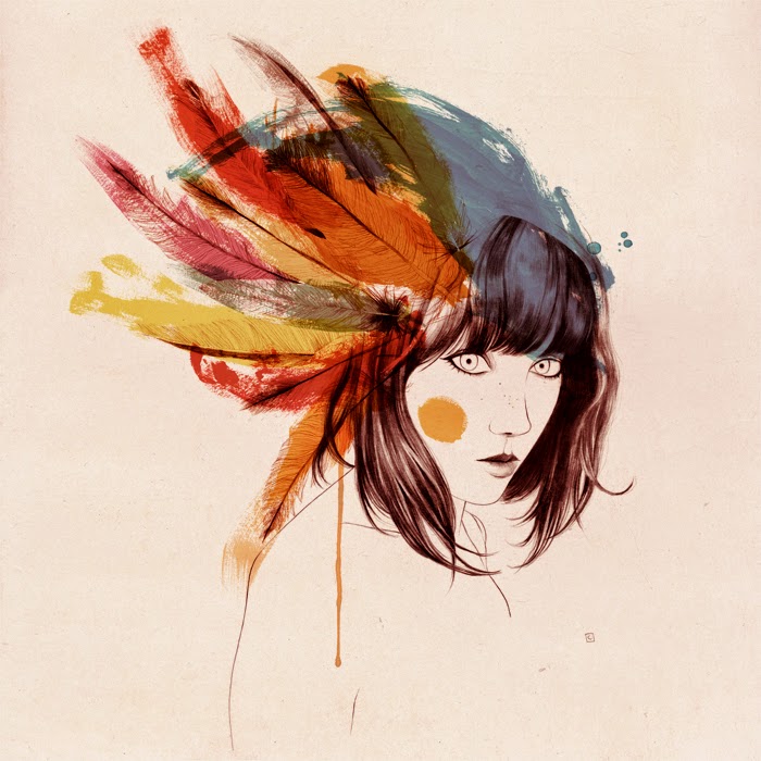
I found some beautiful illustrations by designer, Conrad Roset. On his website he states: Drawing has been a passion and a constant feature in my life. “I search the beauty the body exudes, I like drawing the female figure.”


Friday, 7 March 2014
Experience of Work Week
Today we had to have our final ideas ready to show to Richard and Laura from Keltie Cochrane.
At the beginning of the week we kick started our research by looking into gonorrhoea and syphilis, understanding the signs and symptoms and what these infections could lead to if untreated. We also had a quick look at previous sexual health advertising campaigns from the likes of durex, NHS and local councils. Nick from my group also collected together some information leaflets on chlamydia and C-Cards for young adults. From our research, we realised that a lot of these local campaigns were uninspiring and condescending, considering they were aimed at young adults and people our age (I know that me personally found them childlike). The bigger campaigns were a lot better but seemed to focus on the humour aspect which is a great way to tackle the taboo topic of STIs.
Our group got together and brainstormed some initial ideas. Nick (advertising student) showed us a great technique to bounce ideas which involved writing down 'truths' from the brief and our research and then narrowing these down to the most interesting, stemming further ideas from this. As a team we decided that we wanted to make and impact on the audience by including hard hitting truths about the STIs and the damage they can cause, we felt that this would be a great way to tackle the complacency issue.
We each developed our ideas and got together to chose the best one to take forward to present to Richard and decided to go for a social media ad - current, on trend and hits our target market. Here's what we came up with:
All of our ideas
It was great to get feedback from Richard and Laura, which gave me an insight into how their advertising agency works when generating ideas and developing work.
I've really enjoyed this week, its been refreshing to take part in group work and developing ideas as a team. It was great to also get to know some of the advertising techniques for generating ideas, something that I will definitely be using in the future. The most important thing this week has taught me is that every piece of work must have a strong concept behind it.
Thursday, 6 March 2014
Inspiration - Linder Sterling
One of my tutors introduced me to the wonderful work of Linder Sterling today after discussing some initial ideas for our Keltie Cochrane brief. Linder Sterling is an experimental artist renowned for her crazy collages.
Her designs look slightly 80s porno with a sinister twist, but I love the grunge vibe. Sterling is most notable for her rebellious mass-media collages, combining naked torsos with everyday generic objects to create and obscene image.


Her designs look slightly 80s porno with a sinister twist, but I love the grunge vibe. Sterling is most notable for her rebellious mass-media collages, combining naked torsos with everyday generic objects to create and obscene image.
Tuesday, 4 March 2014
Experience of Work Week
Well we're back at college after a lovely two week break and this week its experience of work week. This week will give us the chance to work together in groups and collaborate with advertising students, so I'm looking forward to picking up some new skills from this along the way.
We've been given a week long mini brief by local design agency, Keltie Cochrane. The brief is all about raising awareness about STIs (specifically gonorrhoea and syphilis) in the local area and encouraging people to get checked out. The deliverables is a poster campaign however we have free reign on any further ideas to support the campaign. Our target market is 18-25 year old women.
The real challenge this week will be completing this task without computers. Richard from Keltie Cochrane has specifically asked that we show our development and final ideas as scamps, back to basics with good old pencil and paper!
I've completed a SWOT analysis for the week ahead:
Strengths: I feel like I'm good at research so learning about STIs and previous campaigns will be my strength.
Weaknesses: My drawing skills are rubbish! I think I will find it difficult to present my ideas through sketches alone.
Opportunities: Working as a team will be a great opportunity to see how other creatives generate ideas. This task will also enable me to gain experience within the advertising process.
Threats: This project gives us one week, meaning only three college days to work together as a team. The time restrictions will encourage us to work at a faster pace and is great industry experience.
Tuesday, 18 February 2014
IKEA Placement - Week 7
Working on more store communications this week, this time for the bedroom section of the store.
For this job I had to take a look at the bedroom department to ensure all the information I had been given was correct.

For this job I had to take a look at the bedroom department to ensure all the information I had been given was correct.
Friday, 14 February 2014
D&AD Pencil Panel
In order to gain a better understanding of competition work, we watched a D&AD pencil panel online, which I found really helpful. The panel gave some great advice on how to develop and create award winning work:


- Get out there and experience the brand
- Stay open to experimenting
- Don't be afraid of making mistakes
- Be original with a new concept
- Be open and share ideas with other people
- Push the boundaries
Answer the brief with a great idea and brilliant execution.
You can take a look at the D&AD Pencil Panel here: https://www.youtube.com/watch?v=1146IAeTQFU
I also had a look at previous award winning work on the D&AD website:
Above: These Ted Baker India designs were my personal favourite. Simple and understated using Ted Baker clothes to cleverly represent the country of choice. This proves that a simple concept can be effective if the idea is executed well.
Above: The ‘big hello’ campaign is a simple concept which addresses the audience in an approachable and friendly manner, speaking to the viewer on their level. This is also a strong cross platform campaign, the designer has considered print and digital, shop windows, apps and more.
Above: This campaign is a clever concept that creates an interesting visual that would appeal to all ages. The app design is on trend and interactive, allows the user to feel involved with the brand and encourages them to continue reusing the app.
After researching both advertising and graphic design award winners I have gained a deeper understanding on award winning work. Each idea is simple and effective, easy to understand at first glance. Most ideas I looked at were used across platforms (for example digital, print, social media) to make a strong overall campaign. The award winners work also showed me that competition work allows you to push boundaries and create a campaign to a huge scale without the restrictions of client based work. The answer to the brief needs to be a strong idea that is executed brilliantly.
From this I have gained a better understanding of what award winning work needs to be.
For my National Trust Brief, I will need to;
- Utilise social media
- Make the audience feel and emotion and/or feel involved
- Create something unique
- Make it simple and easy to understand
- Use all mediums (social media, mobile apps, advertising brochures, exhibitions, events, billboards etc...)
Tuesday, 11 February 2014
IKEA Placement - Week 6
This week I was back working on the store communications and was asked to create banners and ceiling runners as part of IKEAs current ‘Ready, Steady, GROW campaign.
Rather than just photography, I wanted to incorporate some vector design.


Rather than just photography, I wanted to incorporate some vector design.
Wednesday, 5 February 2014
D&AD Brief - Final Design
Our Escape the City campaign included:
- Inspiring posters advertised around the city
- A revamped app that allows the user to create a profile, write reviews and interact with other users
- A National Trust bus service which runs hourly in major cities across the nation (aimed to solve the problem of people being too lazy/National Trust being too far away.)
- Painted buildings throughout cities, advertising the National Trust
- Painted tube/metro stations advertising the National Trust, bringing nature to the city
- A social media trend #Escapethecity to get people talking about the National Trust, sharing experiences and interacting.
I feel that this campaign successfully answers the brief.
The original brief asked us to:
- Reconnect relationships with nature and beauty - our designs will hopefully inspire people to want to visit. The phrases we used were intended to inspire and connect with the public.
- Reintroduce the NT as the connector between people and places - we have made people notice the National Trust by painting buildings and tube stations across the nation, portraying the beauty of nature, all delivered to the public by the National Trust
- Consider the benefits the NT will bring to peoples lives - benefits are spoken to the viewer using our posters
- Express the passion NT has for nature and beauty - we used strong imagery of National Trust locations which portrayed the beauty of nature
- Target a new audience of 25-40 year olds - our designs are current and appealing. Using modern technology, including trends and improving the app, targets a modern audience
- Dispel the impression that the NT is old fashioned - we used stylish designs to give the impression of something current and fresh
I feel that overall we have a strong campaign that will bring in a new audience and put the National Trust in the heart of the city and into peoples minds


Tuesday, 4 February 2014
IKEA Placement - Week 5
This week I was working alongside the marketing team who requested a sustainability design board to be displayed in the co-worker area. Their specification was simply to incorporate the IKEA sustainability pink within the design.
I created some varied outcomes so that marketing had a choice of design.


I created some varied outcomes so that marketing had a choice of design.
Friday, 31 January 2014
Inspiration - Matt Booth
I've found a brilliant designer called Matt Booth who creates details illustrations using only shapes. These illustrations are so creative and look amazing! Experimental design isn't something that has interested me in the past but after seeing these designs, its definitely something I want to try in the future.


Subscribe to:
Comments (Atom)